
Audioverse Concept
UI/UX Designer
Audioverse (self-initiated)
Audioverse is an app with a library of audio material from sermons to songs to audiobooks.
My role
-
An avid user of Audioverse
-
Unsolicited designer for a new concept
Results
-
Analyzed the current app for usability issues
-
Redesigned a concept that's simpler and more dynamic

Analyzing the current app
After getting feedback from users, I made notes and took screenshots of each page. I noticed a few key problems:
Problem 1: A list-heavy, flat UI and an under-utilized dynamic Discover tab.
Problem 2: Extra features that crowd out the main one, sermons.
Problem 3: A confusing navigation structure with multiple navbars and an oddly placed hamburger menu.


Discovery and iteration
How do similar apps handle navigating and exploring their audio material? I looked at both Spotify and Pocket Cast as inspiration. Their home screens were dynamic with featured material at the forefront in a different format than normal.
They also had simple navigation, using only 3 or 4 tabs at the bottom for the main actions. The dark color scheme helped with avoiding too much eye strain and made the audio material stand out as well. I decided to use similar navigation and coloring tactics for Audioverse.

I designed some simple wireframes to outline the general layout of the app. Then I filled in the pieces with the style, trying out a few different layouts and visuals before landing on the final design.


Final design
To address the problems outlined, my key design decisions were:
Solution 1: Used a dynamic format for the Home tab to draw users in.
Solution 2: Removed features like the Bible and Books since they already had other apps.
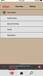
Solution 3: Reduced the main nav bar to the main tasks - My lists, Home, and Search.
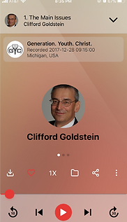
I also added a sermon info page so it was easy to get more info without playing the sermon, and I simplified the sermon playing overlay to the most essential actions.
Use the Invision prototype to click through the app (also linked here).
To switch between light and dark mode, navigate to settings, and change it there.
All icons (except for the Audioverse icon) were custom designed by me.
I made sure to keep the original style as much as possible by using a similar typeface, Helvetica Neue, and having a similar color scheme.
Side by side comparison
Home screen


Sermon playing


I'd be happy to talk more about this if you have questions. Thanks for reviewing!